 |
Homeville
Open 25 Hours
|
| View previous topic :: View next topic |
| Author |
Message |
SABERinBLUE
Pretty Fly for a Blue Guy

Joined: 10 Oct 2005
Posts: 266
|
 Posted: Wed Oct 25, 2006 2:40 pm Post subject: SiB and Creep: The Paragon Project (NSFW) Posted: Wed Oct 25, 2006 2:40 pm Post subject: SiB and Creep: The Paragon Project (NSFW) |
 |
|
If at first you don't succeed... <--Link
...try, try again. <--Also Link
The development of my cyberpunk opus, at this point 3 years old since initial conception, has been spotty and met with varying degrees of success. The first launch was hasty and poorly-planned, a mere three months after I decided that hey, it would be pretty neat to put together an original sci-fi work. It was very bad and very shortlived. 8 pages posted. The second launch took place a half a year later after a considerable reworking and a development of an overall theme. However, some problems persisted from the first launch: I still wasn't extremely good at drawing people and I still had absolutely no idea what I was doing with colors. The latter was a major one. I have never, never been happy with how a page looks after coloring it. 28 pages posted. So now with the recent proposal by our very owm Bob Gnarly/Creep to join the team as colorist, I have decided to cancel the current launch and start anew. Once the comic launches again I anticipate it being FAR more likely to maintain an actual update schedule, seeing as how I'm no longer the one coloring. At Bob's suggestion, we'll do most planning in a thread here. I have forums on my site but they suck, are mostly dead, and are ridden with spambots which I can't be arsed to take care of. If I ever decide to bring the forums back I know a guy who has the superpowers required to block nearly every spambot from registration, but for now, forget it, I'm doing this here.
Now, this will have some spoilers in, but not the really big ones, just more premise types of things. What I mostly forsee happening here is simply discussing the character designs and getting the colors nailed down. Oh and Bob, if it's all right with you I'd like to concurrently post whatever work we turn out here on another forum that I go on (not THoIR).
A brief(ish) rundown of The Paragon Project as a world:
It is the end of the 22nd Century. Most of the Earth has been rendered inhabitable, the lingering results of a global thermonuclear catastrophe that took place at the end of the 21st Century known as Ashfall. The last remaining stronghold of the human race is a gargantuan city-state built on and around what was once South Georgia and the South Sandwich Islands known as Remote South.

Its population: ten billion. Humans subsist on raw materials shipped from mines in the Mars Asteroid Belt, a massive hydroponics field, and a still-mind-boggling energy source known as the Meridian, which flows from an incomprehensible rift in the fabric of space-time, framed by a monolithic launch ramp called Jacob's Ladder.

By the point, mankind has fully settled down after the hell following Ashfall, and Remote South is a prosperous if overcrowded world. The Internet, now integrated into many facets of life, is surrpetiously controlled by an Illuminati-esque cabal of elite hackers known as the Baker's Dozen. Each hacker controls one of the city's 13 sectors. Their existence is a secret from the general public, and their foothold in the workings of the world so strong that neither the legitimate government nor the crime syndicates is able to depose them. However, they are benevolent and their intentions altruistic: they keep the world running as smoothly and fairly as they can; that is their manifesto.
So, let's open with the collab pinup that started this fated union:
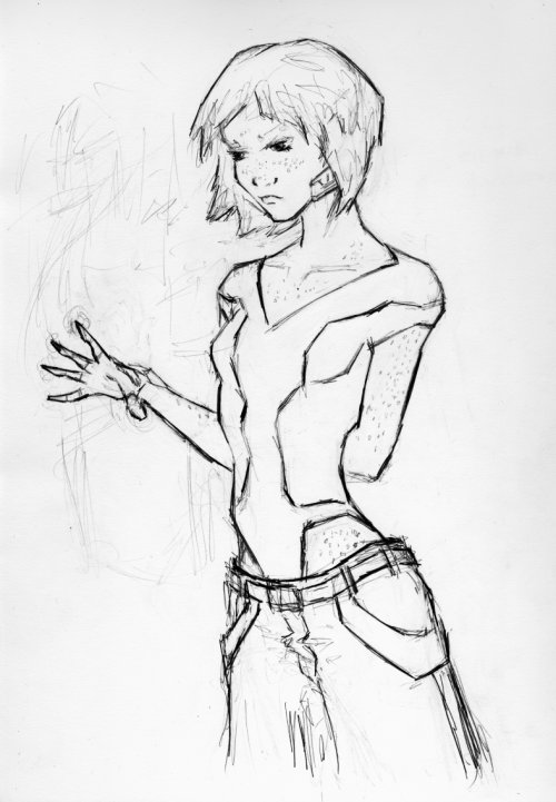
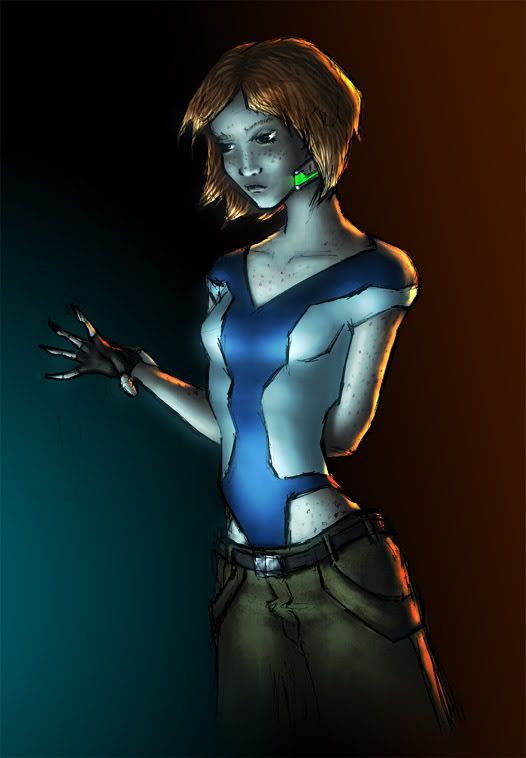
Karen Julia Roan, aka "Hatch"
Born 2195 January 10th, Remote South, Sector 5
Height 4'10"
Eyes Green
Hair Red
Caucasian
Karen was a street orphan who was taken in by Baker's Dozen member Jacob Christopher Roan of Sector 5 and raised as his own child. Character design facets include her abnormally dimunitive stature, messy red hair and numerous freckles, the omnipresence of some sort of leotard, usually (though not in this picture) a very large coat that once belonged to Jake, and various computer-related equipment. She is the character I built the wire mannequin R-Karen for.
More to come, stay tuned!
Bob, I gotta ask you, what resolution did you color this pic in, was it the smaller one or the larger one?
Last edited by SABERinBLUE on Tue Mar 06, 2007 5:21 pm; edited 1 time in total |
|
| Back to top |
|
 |
waf
Courtier
Joined: 24 Feb 2005
Posts: 99
|
| Posted: Wed Oct 25, 2006 9:20 pm Post subject: |
|
|
| Sweet, now SiB and Creep have joined Zach and I in same sex comic marriage. |
|
| Back to top |
|
|
Creep
Noble

Joined: 23 Aug 2006
Posts: 124
Location: Up nord.
|
| Posted: Thu Oct 26, 2006 4:23 am Post subject: |
|
|
| Quote: | | Sweet, now SiB and Creep have joined Zach and I in same sex comic marriage. |
Why can't two chaps have a gay time working on the same comic without every silly bugger getting strange looks on their faces? Nothing queer about it.
| Quote: | | Bob, I gotta ask you, what resolution did you color this pic in, was it the smaller one or the larger one? |
'Twas the big'un.
| SiB's PM wrote: | Whatever you prefer, but it seems to me most natural to refer to you on my site by real name, ie "colors by X". What is it, exactly, unless you'd rather go by internet handle?
|
Guess real name's the way to go. Since it's going to be publicly visible on the comic anyway, this planning-thread's as good as any;
[bond]Mäkinen, Rami Mäkinen[/bond]. Don't forget the umlaut, otherwise it becomes a completely different letter (if those show as weird symbols for some of you, they're supposed to be A's with two dots over 'em).
Stuff to know:
*Timezone: GMT +01:00
*I work very quickly, so don't be surprised if you get the page back a couple of hours after you send it to me
Stuff I should know:
*What resolution are the pages gonna be? 512x768, 600x900, unlimited canvas?
*It's your comic AND your bandwidth so it's your choice how heavy or light the file-size should be (although too heavy JPEG-compression would break my heart). Therefore I should send you the finished product back in a lossless format. But, it's probably not a good idea to mail around Hugh Jazz BMP-files. (Yes, there is a point to all this, and it is as follows) Can you open PNG's?
_________________
The artist formerly known as Bob Gnarly |
|
| Back to top |
|
|
SABERinBLUE
Pretty Fly for a Blue Guy
Joined: 10 Oct 2005
Posts: 266
|
| Posted: Thu Oct 26, 2006 7:56 am Post subject: |
|
|
I can open png. GIMP ftw. Of the ways it doesn't measure up to photoshop, compression is not one.
I have massive bandwidth, but the problem there is how long it takes everyone else to load the page. I'd be all for having it as high a quaity as we can within reason.
Hm, when I was doing the scanned pages, I'd always resize it to 638 width and maintain the aspect ratio. I'm pretty sure the *new* website design that I've been sitting on for like the past YEAR conforms to that. The old first page ends up being 821 tall....poo, wanna try the golden ratio? That'd be 638x1032 by my count. |
|
| Back to top |
|
|
waf
Courtier
Joined: 24 Feb 2005
Posts: 99
|
| Posted: Thu Oct 26, 2006 11:31 am Post subject: |
|
|
| Unless you are going to attempt to sell it in book format don't give yourself vertical constraints. |
|
| Back to top |
|
|
SABERinBLUE
Pretty Fly for a Blue Guy
Joined: 10 Oct 2005
Posts: 266
|
| Posted: Thu Oct 26, 2006 11:44 am Post subject: |
|
|

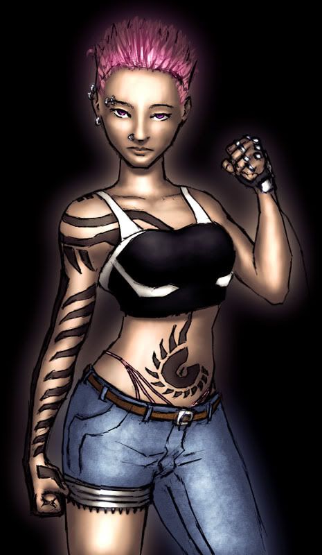
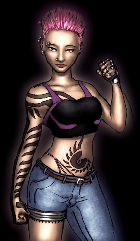
Click for higher res.
Jessica Monica Maroni, aka "modus_pwnens"
Born 2187 April 7th, Remote South, Sector 7
Height 5'7"
Eyes Violet
Hair Black (dye Pink)
Caucasian
Her skin is a bit tanner than Karen's but only a bit. The hair can be shown with black roots if it seems to look good. That particular thong (I refer to it affectionately as "Sans Seraph" is the same pink as the hair. The jeans are normal blue jeans, (with the one leg cut off, below the tech thing is in fact bare skin) and the tattoos are blackwork. For a (nude) guide for the tattoos, refer to
http://www.paragonsigma.com/images2/modusofsnude03.jpg
and
http://www.paragonsigma.com/images2/modusofsnudeback02.jpg
The ear/eyebrow/noserings are captive ball rings, large gauge. Hm, could you try one with red lipstick and one with no lipstick? For lighting, high frontal warm lighting, and then whatever else you want to tack on. The shirt can be any color you that goes with everything else, and it'd probably be neat to do the trim in a different color from the rest of it. The glove on the left hand consists of a black or dark gray band that wraps around the palm and the back of the hand with the tech bits attached to it. The fingers don't have anything on them except for the rings and the knuckle parts, which just stick to the skin.
So, that's about as complicated as it gets. |
|
| Back to top |
|
|
Creep
Noble
Joined: 23 Aug 2006
Posts: 124
Location: Up nord.
|
| Posted: Fri Oct 27, 2006 12:12 am Post subject: |
|
|
Turning out to be a p.i.t.a to get right, so this might take a while.
In the meantime, coupla points:
She looks kind of like she's shaved the sides of her head. This intentional?
And last but not least: Elbows at navel-height, tips of fingers hand-length from the knees, elbows at navel-height, tips of fingers hand-length from the knees, elbows at navel-height, tips of fingers hand-length from the knees DAMMIT.  
EDIT: THAR WE GOES!
Tweaked the proportions a bit. Apologies if ye feel like I've taken a dump on yer creation, but I just couldn't leave it alone.
_________________
The artist formerly known as Bob Gnarly |
|
| Back to top |
|
|
SABERinBLUE
Pretty Fly for a Blue Guy
Joined: 10 Oct 2005
Posts: 266
|
| Posted: Fri Oct 27, 2006 8:59 am Post subject: |
|
|
The problem with the torso widening is that, A, she's 18 in this picture so the wide hips don't exactly fit her body type, and B, it messes with the aspect ratio of the tattoo. Now, don't get me wrong, it's not that I don't want to hear critique on the pencils, but the end result will look much better if, rather than changing the pencils, you just tell me about the problems and I redraw. (Excellent, though, this is an issue we'd otherwise be working through while doing a page. Planning is useful.)
On the actual coloring job though, fantastic. Only thing is the creases from the nose to the corners of the lips should probably be smoothed over to preserve the youth in the face, and the eyes are a darker purple than that.
Hm...I'm looking at my various anatomy books and while I am seeing tips of fingers hand-length from the knees, I'm not seeing elbows at navel-neight. The nude tattoo layout is far closer to being accurate.
EDIT: Oh, sides of the head. Not intentional.
EDIT AGAIN: Oh yeah, and sides of the bottom lips shouldn't have that crease there. Tht should be a smooth transition from lips to chin.
EDIT THRICE: I totally love the hair, man. |
|
| Back to top |
|
|
Creep
Noble
Joined: 23 Aug 2006
Posts: 124
Location: Up nord.
|
| Posted: Fri Oct 27, 2006 10:00 am Post subject: |
|
|
| SABERinBLUE wrote: | The problem with the torso widening is that, A, she's 18 in this picture so the wide hips don't exactly fit her body type, and B, it messes with the aspect ratio of the tattoo. Now, don't get me wrong, it's not that I don't want to hear critique on the pencils, but the end result will look much better if, rather than changing the pencils, you just tell me about the problems and I redraw. (Excellent, though, this is an issue we'd otherwise be working through while doing a page. Planning is useful.)
On the actual coloring job though, fantastic. Only thing is the creases from the nose to the corners of the lips should probably be smoothed over to preserve the youth in the face, and the eyes are a darker purple than that.
Hm...I'm looking at my various anatomy books and while I am seeing
tips of fingers hand-length from the knees, I'm not seeing elbows at navel-neight. The nude tattoo layout is far closer to being accurate.
EDIT: Oh, sides of the head. Not intentional.
EDIT AGAIN: Oh yeah, and sides of the bottom lips shouldn't have that crease there. Tht should be a smooth transition from lips to chin.
EDIT THRICE: I totally love the hair, man. |
The navel-height-thing is of course, as most of these things, just a guideline; it varies, obviously, but it should at least be somewhere close to that, otherwise it just aint gonna look right (incidentally, I myself have the elbows at almost exactly the same height as the navel, and I'm not longlimbed in any sense of the word. No, I'm not disfigured either. Alls I'm saying is that, by having it at that height, at least it won't look directly wrong). As can be seen, they're not exactly at that height in my edit, either.
Plus, I just mentioned that height because it's the easiest way to get the general meaning of the point across. There are other, far more accurate, points of comparison, but I'll be damned if I knew how to even begin describing 'em.
Oh, and I don't quite understand what you mean in the second edit. My brain hurts again.
EDIT: Made those wee changes to the face. Ctrl+F5
_________________
The artist formerly known as Bob Gnarly |
|
| Back to top |
|
|
SABERinBLUE
Pretty Fly for a Blue Guy
Joined: 10 Oct 2005
Posts: 266
|
| Posted: Fri Oct 27, 2006 10:28 am Post subject: |
|
|
Ah, much better on the face. Yeah, I don't think lipstick is something she's ever likely to wear, seeing it on there.
The only big thing here is that if there's an issue with the pencils, just let me know and I'll deal with it. That way, fixes can be made that fit with the overall layout of the page and cetera (and my own personal flaws can find their way into the finished product, which isn't altogether a bad thing). However, I think we can move on from this one. Although, could you un-skew the figure, just with your coloring job still on it, to the way it was before, and show me how that looks? |
|
| Back to top |
|
|
|
|
You cannot post new topics in this forum
You cannot reply to topics in this forum
You cannot edit your posts in this forum
You cannot delete your posts in this forum
You cannot vote in polls in this forum
|
|


