| View previous topic :: View next topic |
| Author |
Message |
SABERinBLUE
Pretty Fly for a Blue Guy

Joined: 10 Oct 2005
Posts: 266
|
 Posted: Sun Nov 19, 2006 9:58 am Post subject: Posted: Sun Nov 19, 2006 9:58 am Post subject: |
 |
|
| Plode it to photobucket and I'll download it and host it before they have a chance to react. |
|
| Back to top |
|
 |
Creep
Noble

Joined: 23 Aug 2006
Posts: 124
Location: Up nord.
|
| Posted: Sun Nov 19, 2006 10:13 am Post subject: |
|
|
Sounds like a plan. You have any updates on the hair situation?
_________________
The artist formerly known as Bob Gnarly |
|
| Back to top |
|
|
SABERinBLUE
Pretty Fly for a Blue Guy
Joined: 10 Oct 2005
Posts: 266
|
| Posted: Sun Nov 19, 2006 10:19 am Post subject: |
|
|
Yeah. I cropped this one to the same horizontal width as the first large image, so all you have to do to resize it is scale it to a horizontal width of 500. The figure probably won't be in the same place on the page but the size'll be right.
By the way, do you have the colors saved in the larger sizes for any of these?
http://www.paragonsigma.com/images2/shade3.1newhair.jpg |
|
| Back to top |
|
|
Creep
Noble
Joined: 23 Aug 2006
Posts: 124
Location: Up nord.
|
| Posted: Sun Nov 19, 2006 10:29 am Post subject: |
|
|
Now that's looking a lot better.
And yeah, I usually keep the original size PSD's around. Usually. Sometimes when I make the cropped JPEG's I post here, it happens that I accidentally save the PSD in small size too.
_________________
The artist formerly known as Bob Gnarly |
|
| Back to top |
|
|
SABERinBLUE
Pretty Fly for a Blue Guy
Joined: 10 Oct 2005
Posts: 266
|
| Posted: Sun Nov 19, 2006 10:30 am Post subject: |
|
|
| Plode whatever bigger ones you have when you plode the fixed hair, word? |
|
| Back to top |
|
|
Creep
Noble
Joined: 23 Aug 2006
Posts: 124
Location: Up nord.
|
| Posted: Sun Nov 19, 2006 10:50 am Post subject: |
|
|
THINK FAST!
EDIT:Well, caught sir, well caught.
_________________
The artist formerly known as Bob Gnarly
Last edited by Creep on Sun Nov 19, 2006 10:54 am; edited 1 time in total |
|
| Back to top |
|
|
SABERinBLUE
Pretty Fly for a Blue Guy
Joined: 10 Oct 2005
Posts: 266
|
| Posted: Sun Nov 19, 2006 10:53 am Post subject: |
|
|
Wow. Just wow. This is totally working for me.
 |
|
| Back to top |
|
|
SABERinBLUE
Pretty Fly for a Blue Guy
Joined: 10 Oct 2005
Posts: 266
|
| Posted: Sat Nov 25, 2006 7:56 pm Post subject: |
|
|
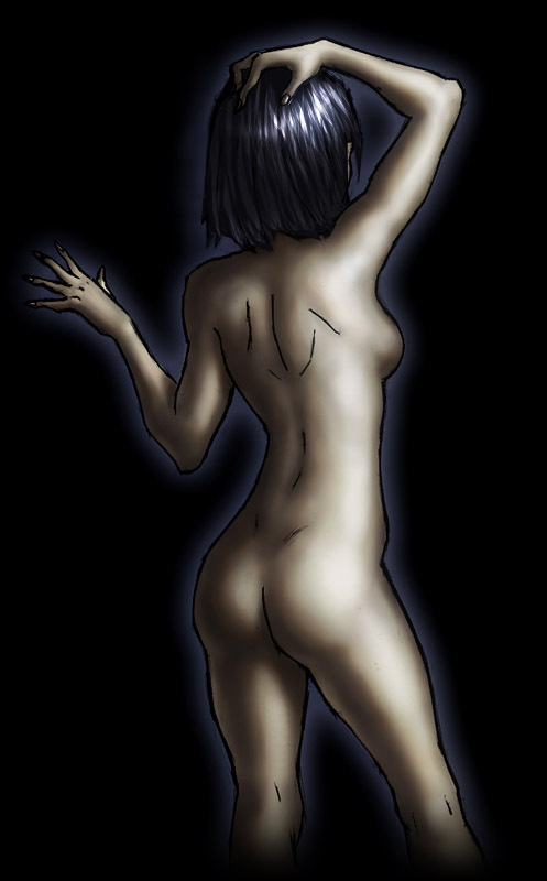
Another shot at modus because I want to have one without screwy anatomy.

Cold lighting from extreme left, with a band of bright light on the right side like you did with the Hatch drawing. Don't do the same light colors as the Hatch job though, more purple and less blue. Make her skin a bit darker this time, leaning SLIGHTLY in the direction of hispanic without really going there. The eyes should be a much darker shade of purple than they were the first time around. The pants and thong should be the same colors as before. On the glove, make the part wrapping around the hand a lighter gray than the individual pieces of the thing. Make the main part of the shirt (the fabric that covers the breasts and makes the small sleeves) a lightish gray and the trim a darker gray. The trim is a harder material than the fabric, but keep it a matte color, don't make it shine like the Paragon armor.
Oh, and I'd love it if you also posted a fullsize version of these colors. Modus is all about the details. |
|
| Back to top |
|
|
Creep
Noble
Joined: 23 Aug 2006
Posts: 124
Location: Up nord.
|
| Posted: Tue Nov 28, 2006 8:33 am Post subject: |
|
|
This worth anything?

And before I forget:


_________________
The artist formerly known as Bob Gnarly |
|
| Back to top |
|
|
SABERinBLUE
Pretty Fly for a Blue Guy
Joined: 10 Oct 2005
Posts: 266
|
| Posted: Tue Nov 28, 2006 5:32 pm Post subject: |
|
|
That's looking fantastic, and there is one alteration. On the neck, my line delineating the sternomastoid is meant to be the edge of the plane of light that you placed to its immediate camera left. in other words:
Dark
Light
It's here:
\,/
And I'd like the planes to be shifted (not the line, the planes) so it's here:
'\/
And THEN it's possible that it might just look better if you deleted the line altogether after moving the planes. So could you toss up alterations to that effect?
EDIT: Also, on the hair, could you try smoothing the sides of the hairdo up to the rough guideline I layed out there? There's a good chance that won't improve it, and it doesn't look bad at all how it is, but just for experimentation's sake.
EDIT2: Holy hell, you put a texture on the jeans. I love you.
EDIT The Third: I keep finding little tweaky things. Could you lighten up part of the face so there is more of this action here?
 |
|
| Back to top |
|
|
|


