 |
Homeville
Open 25 Hours
|
| View previous topic :: View next topic |
| Author |
Message |
Aja
Pajamazon

Joined: 21 Jul 2002
Posts: 2084
Location: Thataway
|
 Posted: Tue Mar 06, 2007 5:56 pm Post subject: Posted: Tue Mar 06, 2007 5:56 pm Post subject: |
 |
|
| SABERinBLUE wrote: | | Creep wrote: | | And what about PM's? Me don't understand. |
I don't fully understand it myself. I'll have the next page very shortly, in like maybe an hour or so. |
No links to gory images on the forum, plz. Putting them in PMs would be better, although to be honest, I'd rather not send any traffic whatsoever from this site to something like that.
Also, huzzah! I'm looking forward to the new page. It's so cool to see these things take shape. :D
_________________
"The one concession a sane man will never yield the universe is that of considering it seriously."
~ James Branch Cabell |
|
| Back to top |
|
 |
SABERinBLUE
Pretty Fly for a Blue Guy

Joined: 10 Oct 2005
Posts: 266
|
| Posted: Tue Mar 06, 2007 6:44 pm Post subject: |
|
|
| Oh, right. I wouldn't link to these images from ANY public place. I can barely handle them myself. Also, bob, bit of a delay. But the pencils will be up today. |
|
| Back to top |
|
|
SABERinBLUE
Pretty Fly for a Blue Guy
Joined: 10 Oct 2005
Posts: 266
|
| Posted: Tue Mar 06, 2007 10:37 pm Post subject: |
|
|
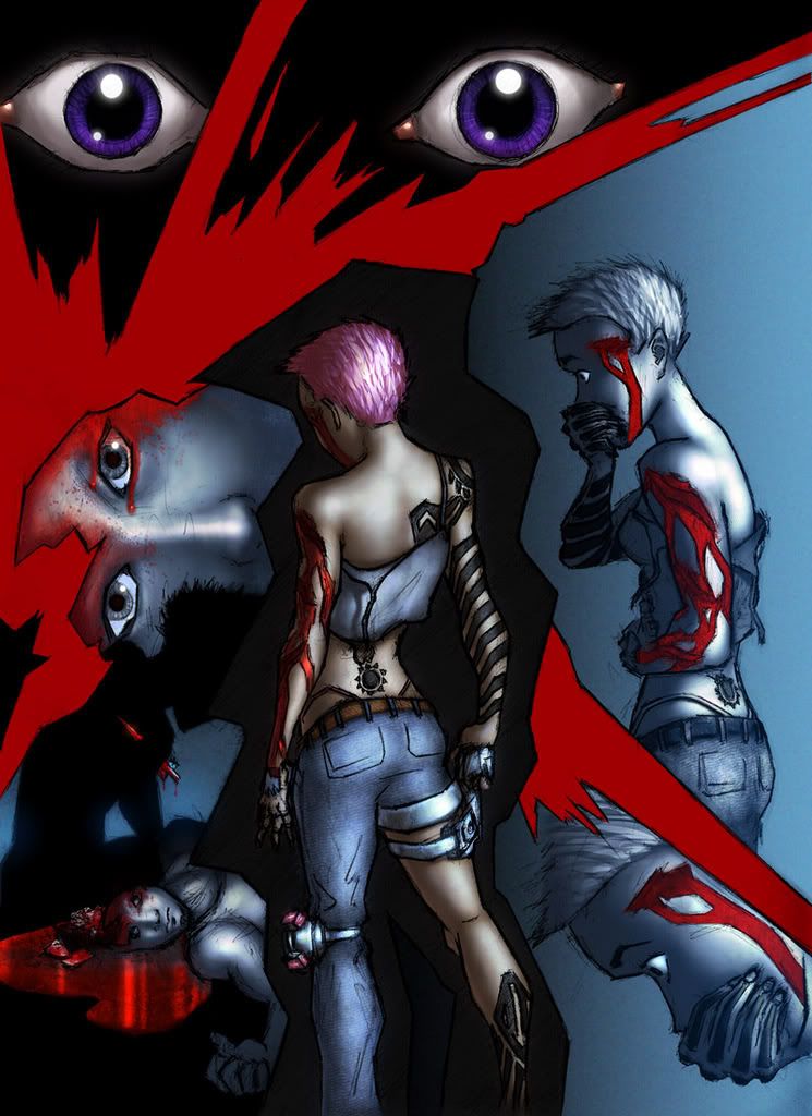
Finally dammit.
WARNING: This page has pretty moderate amounts of blood!
http://www.paragonsigma.com/images2/page09pencils.jpg
http://www.paragonsigma.com/images2/page09colorguide.jpg
The big jagged areas should be colored as shown, in flat tone. I know there's a shading pattern on the black area, but just make that flat. The black areas should be very very dark gray, not quite black but close. The red areas shouldn't be blatant hex red, do bright bloodred to complement the blood that's on the page. Don't worry about how it's mottled on the color guide, that's just the bucket fill being stupid.
Now on the wounds. modus's wounds are marked with green, like the actual lacerations, and the blood is marked in red, so you know which delineated regions are blood and which aren't. I have references of large lacerations if you want them.
We are still in dream mode here. The central pose of modus is a very important one and I want it in full, detailed color. Her back is to the light (the cool blue light), so it's not directly from the camera but it is basically front lighting. Let the tattoos on the arms and leg recede into the black background when they touch. The large eyes at the top of the page are hers, and remember, they're a really deep, rich violet. They should be a bit watery there, but she's not actually crying, just shocked. Around them should be a black region, not skin. Don't worry about showing the eyelashes, just let the outline of the eyes bleed off into the blackness.
Now, every other part of the page (unless noted) should be done in cool, blue tones, except where there is blood, which should stand out bloodred. Moving downward, the orange outline around Riff is the border of his silohuette. So, you know, make sure it's a silohuette. The spike through his shoulder should be the same color as the blood. Make it all sharp and dangerous looking. Yuri, the guy with his head blown off (i have references of this if you need) and the guy in the closeup on the left side, should have a sort of spotlight on his head and right shoulder to show that area brightly, but everything else should quickly recede into darkness. The head wound should be bloodied up enough that details aren't really that visible, and there should be a pool of blood around the head, which I didn't bother to draw. The closeup of his eyes should be very detailedly shaded with front lighting, though keeping in that monochrome blue lighting.
The two shots of modus on the side should still be in the blue-with-red-blood thing, but you can toss in splashes of color like for her skin and her hair etc. She still has her back to the light, so when she bends over in the last panel her face should be more in shadow. The background of those two panels should be a bright cold blue which fades to black as it moves to the left.
Oh right, clothes. modus's hair is dyed pink like usual here, and her thong matches her hair. Also matching her hair are the small glowing running lights on her dark gunmetal knee computer thing, those are marked on the color guide (that's NOT the color her hair should be though, refer to the image on the main page of the paragonsigma site for that). She's wearing blue jeans and a darkish gray shirt. The shirt should be in similar overall shade to the jeans, but not the same color,if you follow me. Like if the image was converted to grayscale they'd be the same shade more or less. Make sure to have a shadow where ithe shirt's hanging off and away from her back. Keep with the skintone from the last page. I don't know why I feel a need to say that, really. Remember her eyebrows are not dyed, they stay black. Her gun should be, you know, the color of a handgun, and it is marked in light blue on the color guide. Yuri's shirt is light in color, for what little of it is actually being shown.
I'm sure I forgot stuff, so don't hesitate to ask. |
|
| Back to top |
|
|
SABERinBLUE
Pretty Fly for a Blue Guy
Joined: 10 Oct 2005
Posts: 266
|
| Posted: Fri Mar 09, 2007 9:45 pm Post subject: |
|
|
| Yo Bob. |
|
| Back to top |
|
|
Creep
Noble

Joined: 23 Aug 2006
Posts: 124
Location: Up nord.
|
| Posted: Fri Mar 09, 2007 10:10 pm Post subject: |
|
|
Yeah?
(The page is a hard one to get quite right but it should be done soon, by the way)
_________________
The artist formerly known as Bob Gnarly |
|
| Back to top |
|
|
SABERinBLUE
Pretty Fly for a Blue Guy
Joined: 10 Oct 2005
Posts: 266
|
| Posted: Fri Mar 09, 2007 10:28 pm Post subject: |
|
|
| Cool cool, I can certainly imagine. Just wanted to make sure you hadn't fallen off a bridge or something. |
|
| Back to top |
|
|
Creep
Noble
Joined: 23 Aug 2006
Posts: 124
Location: Up nord.
|
| Posted: Fri Mar 09, 2007 11:40 pm Post subject: |
|
|
| SABERinBLUE wrote: | | Just wanted to make sure you hadn't fallen off a bridge or something. |
Oh, don't be silly. In my case it's more likely that I'll be found O.D'd on washing powder under a pile of unconscious circus midgets smelling strangely of garlic and covered in cheese fondue ...or something to that effect, anyway.
...Oh yes, the page. As mentioned, it was a right bastard to get right, and I'm not too satisfied with the result, but it's gotta be done some time.
_________________
The artist formerly known as Bob Gnarly |
|
| Back to top |
|
|
SABERinBLUE
Pretty Fly for a Blue Guy
Joined: 10 Oct 2005
Posts: 266
|
| Posted: Fri Mar 09, 2007 11:51 pm Post subject: |
|
|
| Only thing I wonder if could be altered is if the highlights in the eyes could be softened up some. Other than that it looks amazing. |
|
| Back to top |
|
|
Creep
Noble
Joined: 23 Aug 2006
Posts: 124
Location: Up nord.
|
| Posted: Sat Mar 10, 2007 12:00 am Post subject: |
|
|
Which ones?
_________________
The artist formerly known as Bob Gnarly |
|
| Back to top |
|
|
waf
Courtier
Joined: 24 Feb 2005
Posts: 99
|
| Posted: Sat Mar 10, 2007 12:00 am Post subject: |
|
|
| Glock Glock |
|
| Back to top |
|
|
|
|
You cannot post new topics in this forum
You cannot reply to topics in this forum
You cannot edit your posts in this forum
You cannot delete your posts in this forum
You cannot vote in polls in this forum
|
|

